Pale Color Packages And Their Double-Edged Effects
Pale colours have a big impact on our perception of the product.
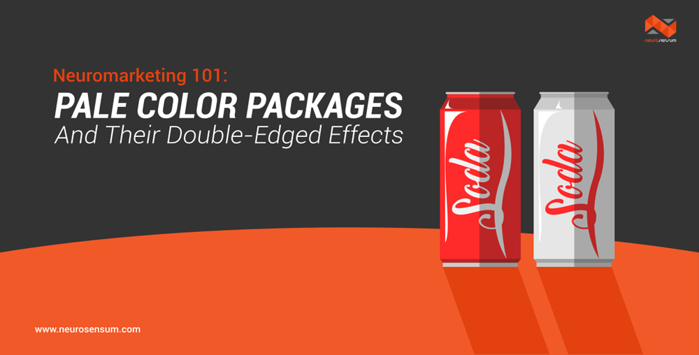
Light-coloured packaging leads to good health, but bad expectations.


–
Imagine walking through your local supermarket to buy some fruits and vegetables.
We are automatically drawn to that intense red tomato because it looks a lot juicier and tastier than the ones that are pale red.
Pale-Colored Packages And Their Double-Ended Effects On Consumers
More and more people try to eat healthily and this is where a lot of brands anticipate on with loads of light- and diet versions of their products. The packaging of these products oftentimes has lighter tones than their unhealthier variant. This is because lighter tones give us the impression that something is less heavy and therefore healthier. However, recent research showed that light-colored packages can lead to opposing inferences about a product and might also lead to negative conclusions regarding taste impressions.The diet food packages often have lighter tones than their conventional variant, which our brains read as “less intense ”. And as humans, we automatically associate less intense color with less intense taste. Especially when consumers are not able to try the product, the negative taste expectations are more powerful in swaying their choice for the worse. In this case, the consumer will rely more on external factors such as the packaging of the specific item.Additionally, the consumption goal of a shopper plays an important role. If a consumer is health conscious, they will be more likely to interpret the light-colored packaging as healthy instead of having negative taste effects. However, when consumers would like to buy a food item for their indulgences, such as chips or soft drinks, the light-colored package will prompt negative taste expectations, leading the customer to put the product aside.
Light Colors: To Use Or Not To Use?
Package color is an important factor in consumer decision making because it is already salient from a large distance. So how can marketers actually benefit from this neuromarketing principle?Well, how to use light colors in food packaging is greatly dependent on the type of product that you are trying to sell. Are you selling food products that are made for indulgences, such as chips or soft drinks? Then you should be cautious with the use of lighter tones. You might even consider darker tones in your packages, such as Coca Cola Zero or Pepsi Max. Darker shades have shown to evoke both healthy and taste inferences equally.You might also reconsider using light colors when consumers are not able to try the product beforehand. Or if you really want to use light colors, you could also make use of food samples or front cooking in the supermarkets. However, do you actually have a diet version of a conventional product that is already associated with health, such as fruit bars, then go for those lighter tones!
Recent Posts
- AI – The Next Generation of Re…November 1, 2018
- Rising stress levels generate …September 18, 2018
 Consumer Intelligence: satisfa…August 21, 2018
 3 Ways Neuromarketing And Lead…August 21, 2018
 How Eye Tracking Research is R…August 21, 2018
 How Behavioural Science is Unl…August 21, 2018
 Using Neuroscience to understa…August 21, 2018
 Is Virtual reality the new rea…August 21, 2018